
 Login
Login

 Data is often said to be the new world currency as any business regardless of its industry has to deal with large amounts of data. Fortunately, new mobile technologies and in particular, mobile business applications have given us incredibly convenient tools for collecting, storing, and working with data.
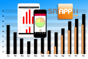
Business data should be understandable and easy to analyze. Data visualization is an important point in the data work. A primary goal of data visualization is to communicate information clearly and efficiently to users via the statistical graphics, plots, information graphics, tables, and charts. Charts are one of the easiest ways to display and analyze data. Snappii, a rapid mobile app development company, has been recently enhanced with mobile charts capabilities which allow users to easily analyze data on their mobile devices.
Mobile App Charts
There’s a growing demand for real-time information in an easy-to-digest format, and app charts is a great solution to meet this need. Charts support is indispensable when it comes to displaying and analyzing the information in real time. This new feature allows Snappii customers to significantly improve their apps and simplify the process of data visualization and analysis. The users can now better perceive data via pies, column charts, line charts, bar charts and scatter charts. There’s a growing demand for real-time information in an easy-to-digest format and app charts is a great solution to meet this need.
How This New Feature Works
For example, you want to collect feedback about your website logo. You are considering changing the color of your logo. You have color choices: blue, green, pink, yellow, none. Create a datasource with these colors, select data type “boolean” next to each choice in the datasource dialog (we will have them as checkboxes) and the field to send colors to (name it choices). Data for the chart will be taken from that text field (choices). You can view the results on the chart right below the question, or add it on a separate tab. Read more in our User Manual here.
First charts appeared in antiquity. Nowadays, people successfully use charts in the graphical view of data in presentations and reports. Today, thanks to mobile app charts, they have a possibility of such data representation on their mobile devices anywhere and anytime.

